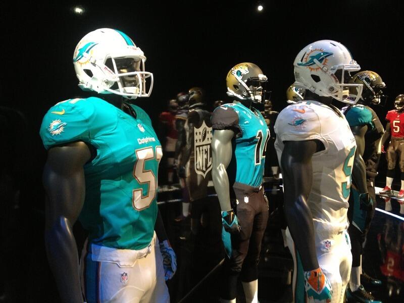
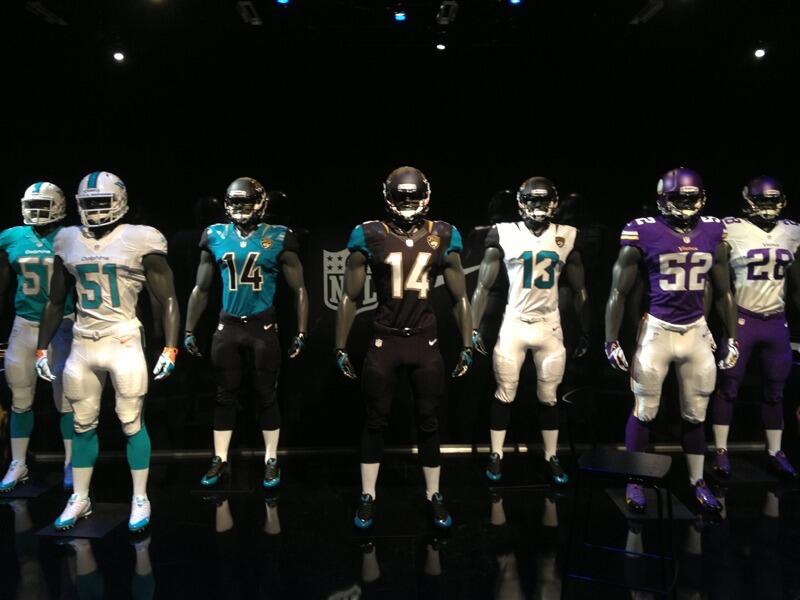
Paul Lukas of Uniwatch has confirmed that these are the new Dolphins uniforms.

Here’s a photo of the new Dolphins uniforms along with the Vikings and Jaguars.

Looking for the latest NFL Insider News & Rumors?
Be sure to follow NFL Trade Rumors on X.com and FACEBOOK for breaking NFL News and Rumors for all 32 teams!


thank you for coming to Sea World … the dolphin show starts at 8 o’clock
Nice classy throwback look… Could do without the logo, but it will grow on me… This is the best post-Shula era uniform without a doubt
I have been a loyal Dolphins Fan for over thirty-five years and i am so disapointed with these new uniforms,THEY SUCK!!! Could they be any blander. Who is in charge of design? they should go back to the drawing board and try again.
Anything that severs all ties with the Jimmy Johnson era is a good thing in my book. Parcells too, for that matter (although JJ had a lot more to do with the ugly uniform redesign in the 90’s). These are a throwback to the early Shula days – sleek and classy.
I love the uniform. I think its classic but very sleek at the same time, and representative of a (hopefully) new Dolphin championship era. The logo is ok, it’ll grow on everybody. In 2-10 years, depending on what fan reaction is (gauged through merchandise sales, of course), they’ll redesign the logo again and go closer to the original. SO if you hate it, don’t buy things with this logo on it. Every time you buy it, you’re voting to keep it around longer.
Horrible….man just Horrible!! The Logo sucks too. I AGREE TOTALLY with Jaison Biagini on at least the way they should have gone. Horrible!!!!!!
Why do we have to change logos ??? Since the merger, some of the cornerstone teams still have the same logo. (Packers, Bears, Vikings, Niners, Cowgirls, Steelers, Chiefs, Raiders, Colts, Cardinals and even the Browns) Why do the Dolphins completely abandon their iconic logo ???
Same reason the Patriots did?
They spent 40 years in the cellar. Until the 2001 season, we dominated the AFC East. We should keep our logo, our history and our reputation.
to make more money on the new stuff
sad but true
what is the browns logo????????
exactly
YUK !! … hate the logo and the uniforms resemble the Jags with the terrible number style. I always hated the Jags uniforms, so this is very disappointing. I’m embarrassed to be a Dolphins fan now.
Have you seen the atrocity that the jaguars will be rolling with this season? At least the new fins uni has some class.
Remember the blue Jersey? It lasted like a season.
They have never once worn a blue jersey.
I would have liked to see all aqua for the road uniforms. Aqua pants with orange stripe white outline.
Agreed
With all the Nike combat hooplah, I am so disappointed in the throwback look. Plain, plain, plain. We missed out on a big opportunity here. We look as bad as the NY Giants.
I miss the uranium orange alternates, hope those make a reappearance; otherwise, the uniforms are a dramatic improvement from the teal/green/blue/not-sure color they were for the majority of the post-Marino era.